New Club Badge ??

Not sure where this came from, other than the old club shop

It looks to be a 1960s version of a half and half scarf

It could be a rare AFCB Brentford ash tray
I have an enamel badge with that exact logo on it except the black lines are gold. I can't post a pic as I put it somewhere safe - so safe that I can't find it. I believe that it dates from 1971.

Back to the original post. I like look of the new suggested badge. It is clear, easily identifiable and the middle cherry is a nod to our shirt badge. However, as it mentions 1899 should it not read Bournemouth and Boscombe?

As mentioned by a number of posters, this would be good on a clothing line but not to replace our shirt badge.
 
I mentioned before that retro kits that are used once a season are a big money raiser for US sports clubs. I predicted they might do something like that here to sell more "jerseys".
 
MBJ got so much social media attention for this hoodie it was inevitable that they would put one on sale.
Trademarking the badge for it just seems obvious.
I understand those who don’t go for this kind of marketing - but both my kids are desperate to own one of these.

IMG_2671.jpeg
 
Opening post mentioned new club badge?

That is a bit different from what has been mentioned re the hoodie above.

So if that is what the club are on about I have no problem with it.

As long as they keep our D D one.
 
But certainly not a bad logo for a variety of clothing which people may not want to be too football/soccer looking. I could see the sense in having a second trademarked logo for that sort of thing.
Agree with this.
Lots of nice clothing ect. In the club shop but there's only so much AFCB clobber you can wear day to day without looking a bit mad!
 
Our current badge is the best in football.
I did mention it at the time, but the Spanish DAZN commentator for one of our games this season did dedicate five minutes of live commentary to telling his audience that we had one of the very best kits and club logo in world football. He said that the classic red and black stripes, combined with our iconic crest, made our kit absolutely one of the best there is !
 
I have an enamel badge with that exact logo on it except the black lines are gold. I can't post a pic as I put it somewhere safe - so safe that I can't find it. I believe that it dates from 1971.

Back to the original post. I like look of the new suggested badge. It is clear, easily identifiable and the middle cherry is a nod to our shirt badge. However, as it mentions 1899 should it not read Bournemouth and Boscombe?

As mentioned by a number of posters, this would be good on a clothing line but not to replace our shirt badge.
My Definite AFC Bournemouth History book has team photos of Boscombe in 1899/1900, 1912/1913, 1921/1922 and one of B&BAFC 1933 and none are sporting a badge on the shirts. Although the photos are in black and white I know that back then we played in red and white vertical stripes.

The photo that I have taken from the book is too large to download. How do you make an image smaller?20240225_182850.png
 
Last edited:
I did mention it at the time, but the Spanish DAZN commentator for one of our games this season did dedicate five minutes of live commentary to telling his audience that we had one of the very best kits and club logo in world football. He said that the classic red and black stripes, combined with our iconic crest, made our kit absolutely one of the best there is !

Brilliant
 
My Definite AFC Bournemouth History book has team photos of Boscombe in 1899/1900, 1912/1913, 1921/1922 and one of B&BAFC 1933 and none are sporting a badge on the shirts. Although the photos are in black and white I know that back then we played in red and white vertical stripes.

The photo that I have taken from the book is too large to download. How do you make an image smaller?

Simplest is to open it in MSPaint and resize it to 50%
 
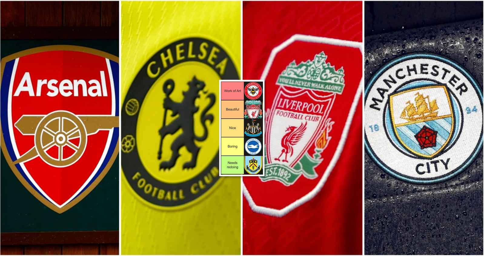
It’s all down to different views, but this website has us in 20th place.

Nottingham Forest are 1st.

These people clearly don’t understand graphic design.
They should look up the meaning of the word iconic.
The simplicity of our logo makes it iconic.
Something which very few of the other logos featured can claim.
 
My Definite AFC Bournemouth History book has team photos of Boscombe in 1899/1900, 1912/1913, 1921/1922 and one of B&BAFC 1933 and none are sporting a badge on the shirts. Although the photos are in black and white I know that back then we played in red and white vertical stripes.

The photo that I have taken from the book is too large to download. How do you make an image smaller?View attachment 13427
Managed this
 
These people clearly don’t understand graphic design.
They should look up the meaning of the word iconic.
The simplicity of our logo makes it iconic.
Something which very few of the other logos featured can claim.
This is how they described the Forest one.

The tree; the font; the general funkiness… Exciting and utterly iconic in its simplicity, Forest’s badge is stunning proof that sometimes, less really is more. There’s a reason it’s barely been touched since its introduction almost 50 years ago. Art.
 
This is how they described the Forest one.

The tree; the font; the general funkiness… Exciting and utterly iconic in its simplicity, Forest’s badge is stunning proof that sometimes, less really is more. There’s a reason it’s barely been touched since its introduction almost 50 years ago. Art.
Iconically shite, yes.
 

;