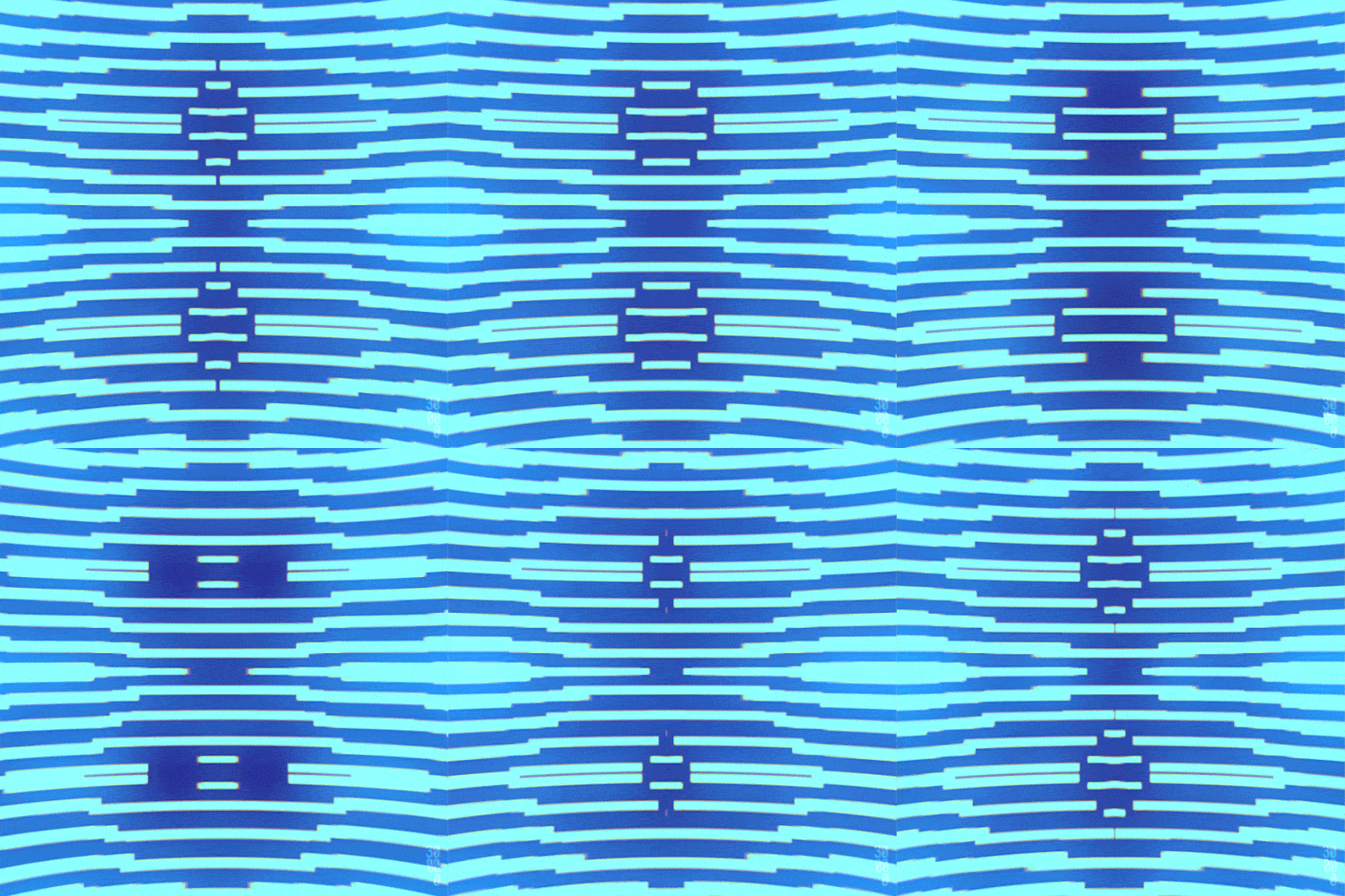
Away kit

Ours suddenly looks better already.


(Oh look another green kit)
That is truly ghastly. According to the Beeb

The new strip features a yellow base colour, black lines that the Gunners say are "inspired by the map of Islington", and light-blue accents on the collars and sleeves.

The club added that the design "represent the journeys supporters make out of the club’s home borough for away days on the road".


You just could not make it up.
 
Look into my eyes... stood behind someone wearing that shirt after a few pints:wack:

tumblr_nk5obuAhN41s4fz4bo1_500.gif
 
Well, I want to thank every single person who has been part of the design process of this shirt and all those who make these important decisions. I couldn’t care less if I like it. It’s all down to whether the little one likes it or not.

And my 7 year old absolutely… hates it. “It’s the worst kit I’ve ever seen. It’s rubbish, terrible decision by Umbro”.

His 9 year old mate said, “that’s disgusting”.

So they don’t appear to be the target audience either. No bartering over spending £55 on that then. :utc:
 
Wonder who copied who? BT Openreach stealing our idea or did Umbro's chief designer see what I've seen?
 

Attachments

  • Screenshot_20230719-141548~2.png
    Screenshot_20230719-141548~2.png
    402 KB · Views: 3
Well, I want to thank every single person who has been part of the design process of this shirt and all those who make these important decisions. I couldn’t care less if I like it. It’s all down to whether the little one likes it or not.

And my 7 year old absolutely… hates it. “It’s the worst kit I’ve ever seen. It’s rubbish, terrible decision by Umbro”.

His 9 year old mate said, “that’s disgusting”.

So they don’t appear to be the target audience either. No bartering over spending £55 on that then. :utc:
Similar story here.
My sons 10th birthday next week, we always buy him a shirt as a present, I showed him this yesterday and he said "oh... you're not getting me that one are you?"
 
  • Like
Reactions: DJ
My friend made the wonderful observation that it looks like a shepherd's pie:


View attachment 11351
I'd be onboard with those kind of wavy lines.
I object to the way the waves on the shirt are all over the place and crossing one another in weird angles. It just looks chaotic to me.
But a nice wavy motif like on this pie would have been much easier for my eyes to deal with. Also it would be nice to have a shirt inspired by a staple of English cuisine. The marketing department could really get their teeth into that one ( pun intended ! ) :p

Thanks though. Now I'm hungry ! :censor:
 

;